
Most personal websites describe their subject. I felt it only fitting that mine behaved at least a little like me. I spent months designing and coding each component, feature and line of copy. From the outset, a triptych of ideas drove the build: a landing page inspired by Sol LeWitt and the aesthetics of network theory. An about page as an auction lot, and an archive for projects that don’t sit neatly in the same box, driven by the practicality of industrial component catalogues.
 About Page
I’m often asked, as if muscle memory, or on rare occasions out of quasi-curiosity, by dealers, collectors and gallerinas alike: “Who do you like at the moment? What have you seen that’s good?”. It’s the international veiled barometer of taste, and by extension, tribal acceptance, answer dependent of course. It gives one a springboard to unload, in turn, their latest hot take. Held in like a well mannered child, hand raised, red in the face, who has yet to be picked, but has the niche answer ready to go before anyone else.
Back in the real world, amongst civilians, I find it to be the default conversation starter for those with a natural inquisitiveness. Those who don’t spend their days trawling Artnet’s Price Database or use “Cat Rais” as a normalised lexicon. I straddle both of these worlds at present and thought it pertinent for my website to present as conceptually playful, whilst utilitarian and informative. As engaging for the Cat Rais warriors as it is useful for that uncle at a wedding, or a date who might earnestly ask, “Who’s your favourite artist, then?”.
To answer that question, I’ve never had a static answer, but the name that has consistently topped the list is Sol LeWitt. Should they not have switched off (understandably) by the time I get to what he does best, his Wall Drawings.
Landing on LeWitt
To my utter fascination, and the outrage of anyone still flinging “my child could have done that” around, LeWitt’s Wall Drawings were executed by the hand of others. Should your child have been lucky enough in the 1970s and 80s, they could have. Wall Drawings #392 and #393 were even commissioned by Musée d’Art Contemporain of Bordeaux for children to specifically draw at the Museum’s Atelier d’Enfants1. LeWitt authored the instructions, the execution of the work followed. Those familiar with the realities of a studio practice won’t raise an eyebrow here, but the instructions were intrinsic to the work, rather than delegation amongst a wave of exhibition deadlines as is most commonly practiced today.
 Sol LeWitt, Wall Drawing 289, 1976. Whitney Museum of American Art, New York
Precise, concise, bordering IKEA-esque, these directives produced lines drawn between specified points, building up geometric compositions and constellations of vertices. The instructions themselves act as a maquette of sorts. Conceptually, it was the starting point for the landing page and the website. Like a Wall Drawing, it had to be aesthetically engaging whilst simultaneously getting you somewhere. It had to instruct you.
In his 1967 Artforum essay, Paragraphs on Conceptual Art, LeWitt wrote:
“When an artist uses a conceptual form of art, it means that all of the planning and decisions are made beforehand and the execution is a perfunctory affair. The idea becomes a machine that makes the art.”2
If you’ve made it this far, then that planning has paid off and the decisions have been set in binary stone. I’ve set the rules: four points, a slow organic drift when observed, with an inherent resistant behaviour, hard coded to snap back when dragged or bothered from its peaceful wandering across your screen. Those points carry the four destinations, About, Projects, Contact and Playground. The lines connecting them give the navigation a composition of its own. A wall drawing with utility, kinetic enough to appease our squirrel-adjacent attention spans, with information rich pages on arrival, for when the novelty wears off. For the technically inclined, it was built with Astro, with Three.js rendering the landing graph, d3-force physics driving its motion and Lenis handling smooth scrolling.
My interest in network theory sits somewhere in this, too. I’m drawn to the way a set of points becomes more interesting through its connections. On the landing page, those connections are visible, moving one part changes the arrangement around it. The geometry gives that a form you can play with, before getting on with the rather more practical business of finding out what I’ve done (About), what I’m doing (Projects) and what I plan to (Playground).
 Sol LeWitt, Proposal for Wall Drawing, Museum of Modern Art, New York, 1970
LeWitt also excites me for his cross-pollination of practice, another reason I was driven to base the website of his practice. In Dance (1979), he collaborated with the exacting choreographer Lucinda Childs and biblically important composer Philip Glass; perhaps my favorite composer (I listened to Glass Works for most of the build to keep me sane). Choreography, music and projected film sit alongside one another, each contributing to the same work. That willingness to let different disciplines share a structure appeals to me, and turns up elsewhere on the site as well as throughout my career, daily thought process and outlook on the world.
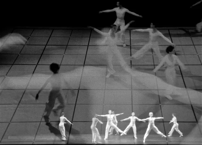 Lucinda Childs, Philip Glass, and Sol LeWitt, Dance, 1979 (2009 revival at Bard College). Photograph: Sally Cohn, courtesy of Lucinda Childs © Estate of Sol LeWitt 2021
A lot of autobiography and Ruff’s Passport Porträts
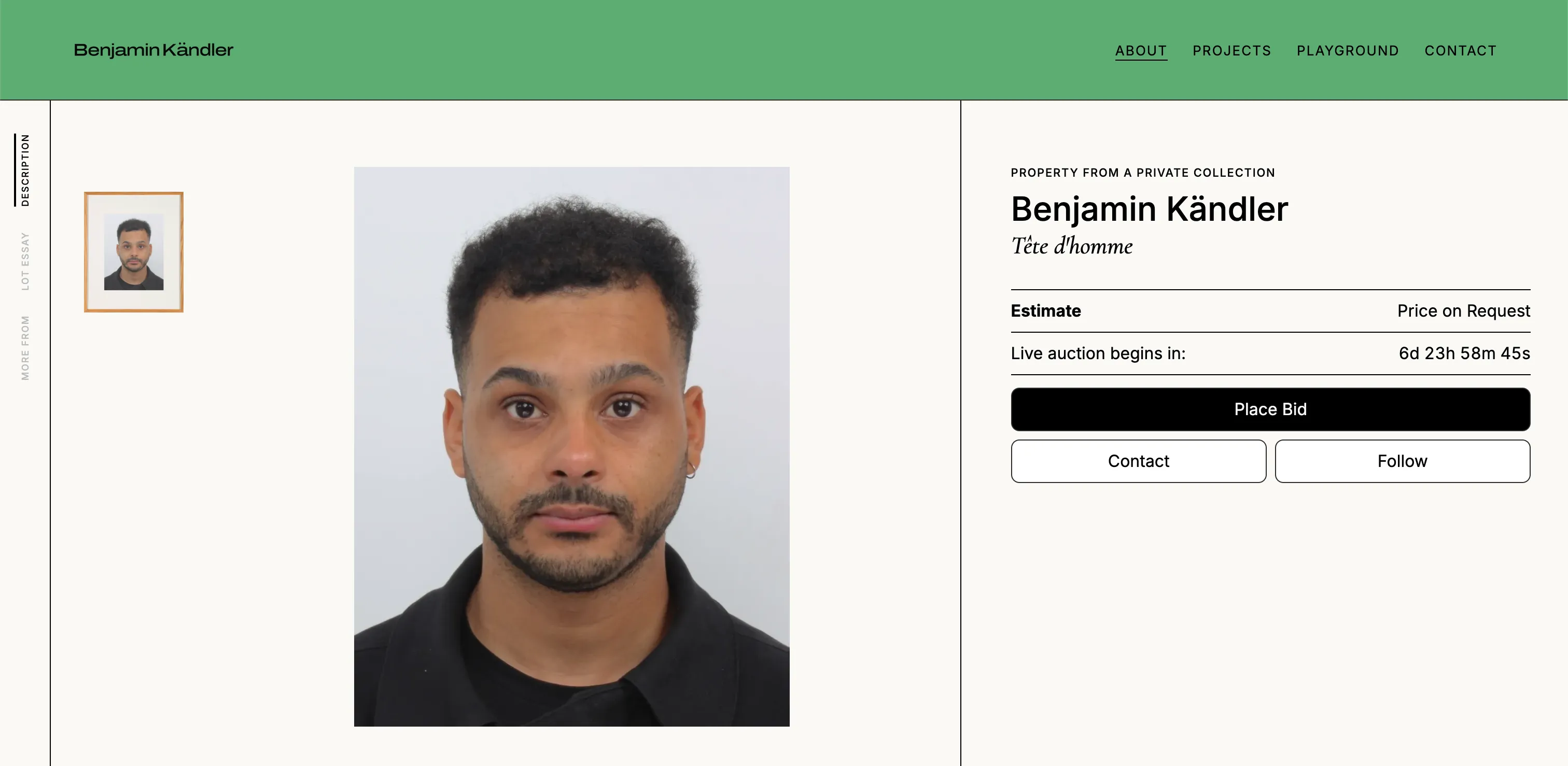
As someone who prefers the production seat to a leading role, I fear the about page. The only phobia stronger is the prospect of a bland one. That blandness is surprisingly common with portfolios of even the most wickedly talented creative types. You know who you are… we all do. I decided to model mine on an auction lot page, fitting given the industry that has driven so much of my career and whose slick, balletic mechanics still fascinate me.
 Thomas Ruff, Porträt (P. Stadtbaumer), 1988. Chromogenic print
Property from a private collection, estimate on request, an auction that is forever about to begin. Even a lot essay. I salute you if you’ve made it this far through my yapping. Provenance, literature and a catalogue description become a way of presenting a life through what can be recorded, contextualised and marketed. Valued even, although I’m still price on request and I do encourage you of course, to submit an enquiry. The career history sits under provenance; the literature section reflecting what I’ve got piled up on my bedside table. Curators spend their lifetimes attempting to communicate ideas and narratives of others to others. I’m still yapping, back to the build!
Let’s summarise this decision in the words of a 3-time Emmy winner: “No one knows what it means, but it’s provocative… it gets the people going!”. You can also use this quote when you visit Frieze London this week or any contemporary exhibition for the foreseeable, odds are you won’t be wrong.
The lot image, an ode to Ruff’s Porträts. Frontal, clinical, as expressionless as the metropole commuter. Undeniably cool. The passport photograph is the universal, utilitarian format for identification. Telling you remarkably little about someone and behaving as a continually ubiquitous format, whether used by a diplomat or refugee. Not the most flattering, but the most empathetic, global and relatable format I can surmise. It suits an about page built from records: the image establishes the subject, and the information around it supplies the detail. Paired with the utility of an auction lot page format, I find it to be punchy. If the format can do justice for a Degas, I’ll take it. How do you make an about page interesting? Making it a ‘CV passport’, then feign auctioning it off?
What I like in Ruff’s Porträts is that tension between a photograph’s apparent neutrality and how much it withholds. The more standardised the image, the less it seems to give away and the more curious I become about its subject.
 Benjamin Kändler, phone bidding at Phillips, London, 2022.
 Thomas Ruff, Substrat 38 II, 2008. Chromogenic print
The auction always resets to six days, twenty-three hours and fifty-nine minutes away. Close enough for a little excitement or nervousness, depending on which side of the transaction you sit. “Place Bid” completes the concept. Apparently I found this less exposing than writing a normal biography. Overkill perhaps?
Evident from the lot page is a zig-zag of experience, an amalgamation of skills built from a perpetual curiosity for the arts, heritage and systems. Much of what I do involves blending, titrating, highlighting or dissecting elements of fascination, innovation, history and experience. I’ve always said art is anything which shows the world from a different perspective. I think my curatorial approach is akin to music sampling, conveying moments past, conceptual discovery or personal curiosity, while keeping it catchy enough to leave the hook in your head. What does Slum Village’s Selfish tell you about Aretha Franklin, or JMSN’s Soft Spot about Ghost Town DJ’s My Boo?. When consulting, I take the same approach, dissecting elements clinically, working out how we got somewhere, then sampling, blending, producing until we can mix and master a solution in the most innovative and systematic way possible.
To the window… to the wall… to the sweat dripping down my brow as I lead an exhibition tour, conveying why I’ve paired works exploring quantum entanglement and archival poetics. The website gives those different interests somewhere to sit alongside one another, contextualising a broader professional practice.
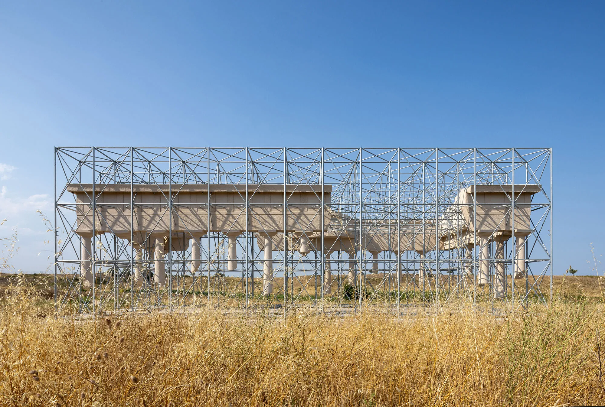 Gijs Van Vaerenbergh, Inverse Ruin, Policoro, Italy, images © Roberto Conte
Archived by Design
What can I say? An archive gets me going. Perhaps it’s the fortune of getting to work with them or the wondrous, finite nature of them. It could be the human urge to define, categorise and systematise… I can’t be the only one? To group and subdivide the natural world, the built environment and everything in between until we give ourselves a migraine. Myself included.
Working across museums, galleries and auctions has made the organisation of information difficult to separate from the objects themselves. A record tells you what you’re looking at, where it belongs and how to find it again. When it came to organising my own projects, I had a similar problem on a considerably smaller scale. An exhibition, a brand collaboration and a heritage project don’t necessarily announce a common thread. They still needed to share a page.
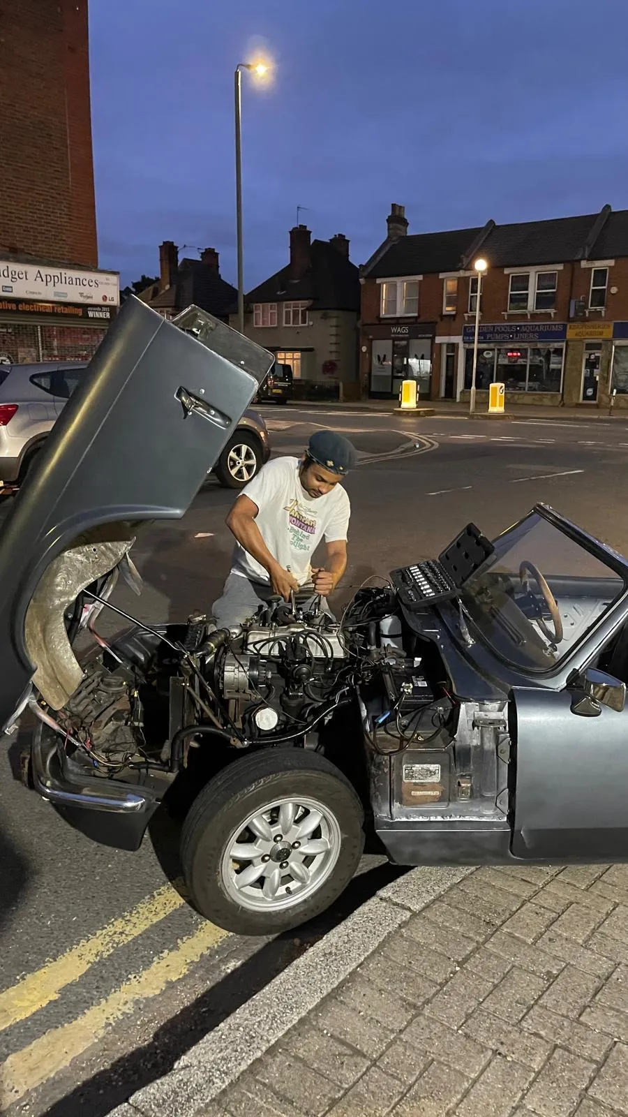 Broken down, fixing HS2 Carburettors on my 1973 Triumph Spitfire MkIV, circa 2021
What does this rambling have to do with 70s British sports car parts suppliers, you’re obviously bursting to ask. The main organisational reference was Moss Europe’s Triumph Spitfire parts catalogue. Which for one year, became a biblically important part of my life. As useful Haynes manual, as efficient as Amazon Prime. Its exploded schematics spread a mechanism across the page, each component numbered and corresponding to its table below. I would find myself endlessly scrolling to reveal delicate ingredients, which, when united in the right hands, might form something as useful as HS2 Carburettors. This industrial organisation system was so useful that you could identify a small part without losing sight of the broader context. I’m interested in that relationship between the whole and its constituent pieces. Every schematic, no matter how aesthetically endearing, has a job to do. The numbers mean something; they let you move between scorching efficiency and practicality.
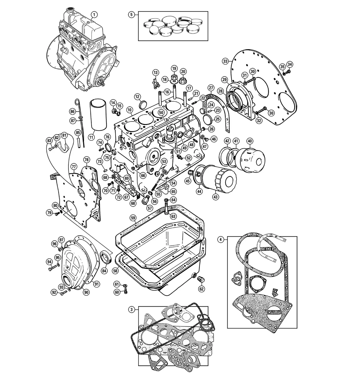 External Engine - Spitfire MkI-1500 (1962-80) Schematic, moss-europe.co.uk
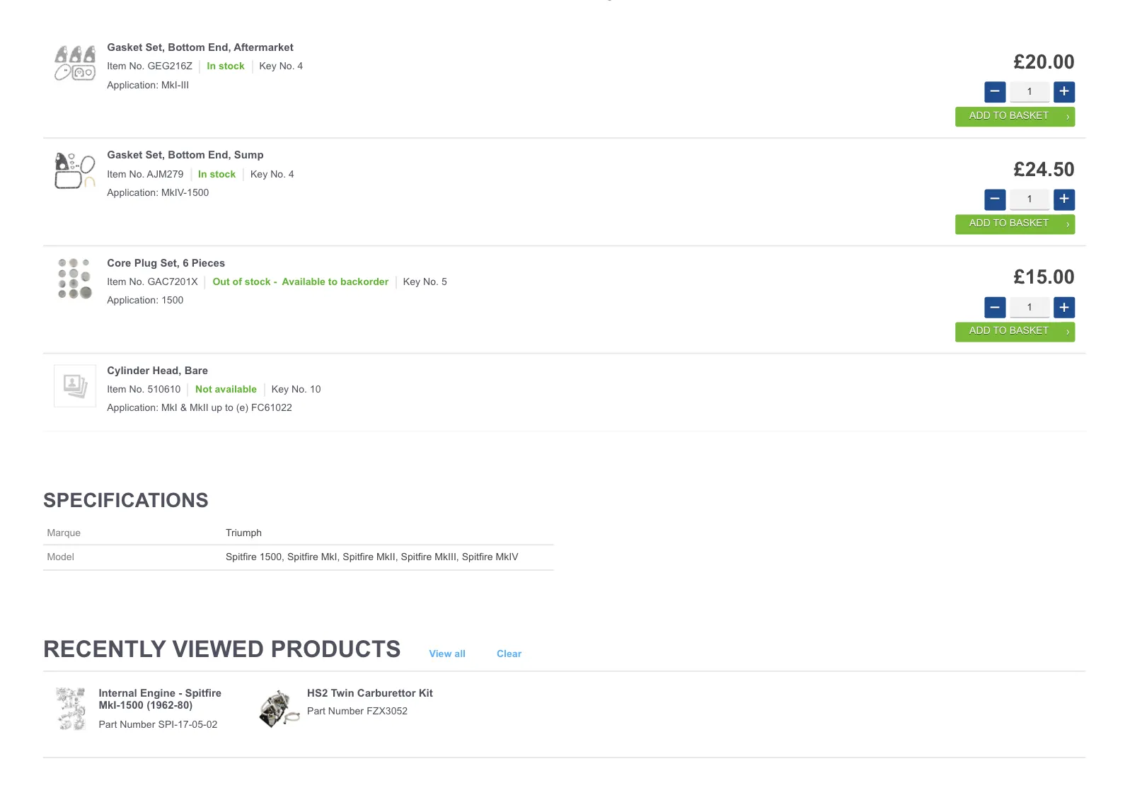 Parts Table, External Engine - Spitfire MkI-1500 (1962-80) Schematic, moss-europe.co.uk
On the projects page, that translates to an index with rows for year, project, featuring and category. The repeated labels and dividing lines let you scan across the work before choosing an entry. Leas Lift and States in Flux can occupy neighbouring rows without pretending that a water-balance funicular and a contemporary exhibition are the same sort of undertaking. The format provides the common ground; the entries supply the differences.
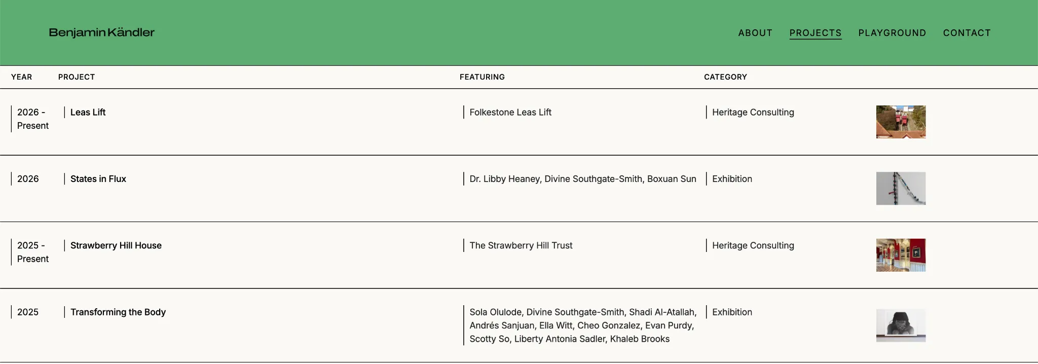 Projects Page
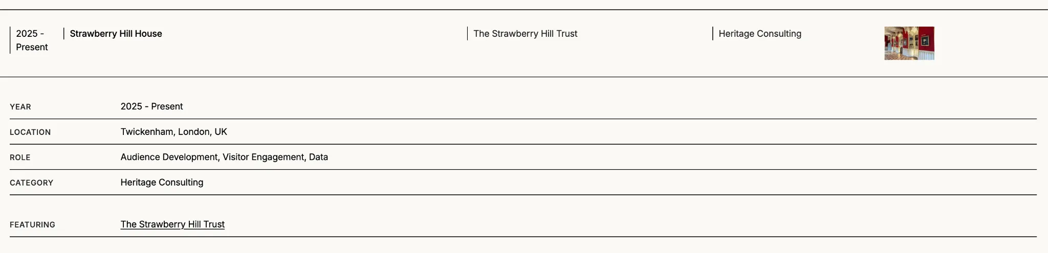 Expanded Information, Strawberry Hill House, Projects Page
Opening a row reveals the fuller record: location, my role, the client or collaborators, a description and the images. That distinction between category and role matters. ‘Exhibition’ tells you what the project was; ‘Curation’ tells you what I did. These systems matter. I wanted the page to make both available, rather than asking for a photograph to explain my involvement.
The photographs are numbered as figures within each entry. It’s a small borrowing from the language of manuals and catalogues, but it gives the images a place in the record. They can be viewed individually while remaining attached to the project. The collapsed row keeps the index readable; the expanded entry gives the work room to be looked at properly.
The categories are useful, although they can only do so much. Ex-Machina appears as both an exhibition and an auction, because it was both. I wanted to leave room for that overlap. The whole point of the archive was to organise the range of things I do without having to tidy the range itself into a more convenient version of my career.
There is some relief in having a format that can accommodate the next project. I can add a record, keep the context and let the relationships between entries become clearer over time. For someone prone to finding another connection, another reference or another thing to explain, a place to put it is quite useful. I hope in time, this website will become that vessel.
Footnotes
-
https://www.paulacoopergallery.com/exhibitions/sol-lewitt4#tab:slideshow ↩
-
Artforum, 1967, Paragraphs on Conceptual Art, P.80 ↩